This year Newport’s Web Team have developed a bespoke internal portal (written in .NET), with targeted content and views for students and staff. myNewport will replace the existing staff intranet and student mLE (My Learning Essentials), and will be launched before the start of the new academic year. Learning and teaching material will be held on Moodle 2.0, which will be linked through from myNewport.
It was designed and built from scratch in house by the Web Team, specifically for this purpose. The CMS (content management system) for myNewport was created for an easy transition for existing users, and it also simplified many standard processes. Content can be tagged for staff, students, both or private, making it a very powerful and innovative system for higher education. myNewport has been designed around improving internal communications through targeted internal news, videos and improved delivery of content.
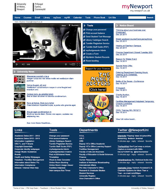
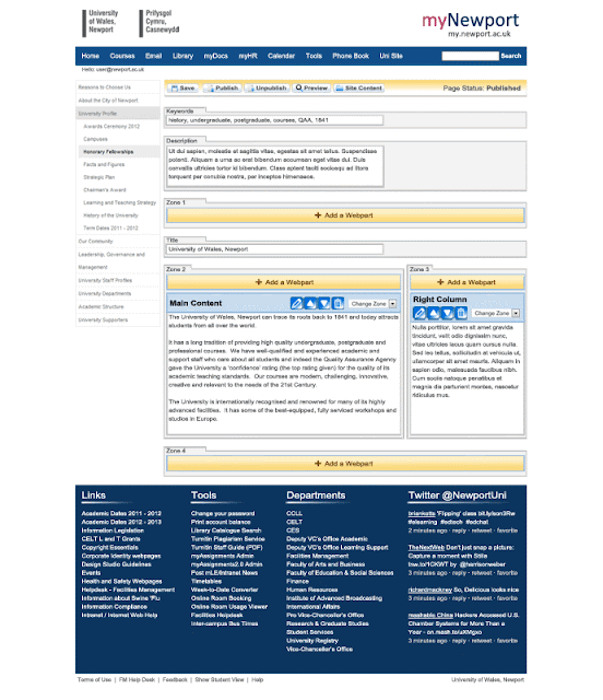
Below is an example of the myNewport homepage, and an example of what a page in the CMS will look like:
Homepage Design:
CMS Design:
We are the Web Team at the University of Wales, Newport and this is our blog keeping you up-to-date with everything we do. We are a small but perfectly formed team creating and managing the University's website, intranet, mobile apps and multimedia.
Showing posts with label user experience design. Show all posts
Showing posts with label user experience design. Show all posts
Tuesday, 7 August 2012
myNewport - Bespoke Higher Education .NET Intranet & CMS
Monday, 16 January 2012
Newport's Website Re-Design
A year on we thought it was about time to take a look back at our re-design of Newport University's website. Newport’s re-designed corporate website (www.newport.ac.uk) was launched late 2010. The old site suffered from information overload with a mass of links and banners across the homepage. It had grown so large that it became difficult to manage and content needed to be refreshed and improved. The challenge was to re-design the website, while promoting key corporate messages and improving the user experience, resulting in increased student applications, business engagement and alumni membership.
The old website:
It was decided that the new design should be bold and simplistic, with a focus on incorporating innovative multimedia, especially video and visually captivating photography. Several key points of entry to the site were designed into the homepage; the large rotating banner directing to very important content, the three student recruitment focused boxes underneath the banner and finally featured news and events. The standard footer, consistent across the site, links to our multimedia channel (including video and audio) and to our social media channels. The top level navigation uses drop down menus to reduce the time it takes for the user to find the information they are looking for.
The new website:
One year on and the robust design is still as effective as the day we launched. We are constantly improving it and we are working on making it more mobile friendly.
Subscribe to:
Posts (Atom)


